


I Tried Redesigning My Blog with Google Stitch - Here's How It Actually Went
5th April 2026 • 12 min read — by Aleksandar Trpkovski
Play audio summary
Google first launched Stitch at I/O 2025 as an AI experiment - you'd type a prompt or upload a sketch, and it would generate UI designs and front-end code using Gemini. It was interesting but limited. Then in March 2026, they shipped a major update that turned it into something much more ambitious: an infinite AI canvas with a design agent, interactive prototyping, voice commands, a DESIGN.md export for design systems, and an MCP server for plugging into developer tools. Google calls the new approach "vibe design" - you describe the mood and objectives you want, and the AI handles the visual decisions.
My blog at trpkovski.com has had the same design for five years, and I've long run out of ideas for how to refresh it. The timing felt right to put Stitch's new capabilities to the test on a real project - not a hypothetical landing page, but my actual multi-page personal site.
What followed was a full day of experiments. Some clear failures, one genuine breakthrough, and a hard lesson about the gap between AI-generated design and production-ready code. This is Part 1 - the design journey. In Part 2, we'll take what Stitch produced and build it into a real site with Claude Code. Stay tuned for that.
What I Was Working With
My blog at trpkovski.com is built with Nuxt 3 and Tailwind CSS (source on GitHub). It has seven sections: Home, Articles, Article Detail, The Keyboard Lab (my mechanical keyboard collection), Through The Lens (photography portfolio), About Me, and Get In Touch. Not a simple landing page - a real, multi-section personal site with a colour system of 12+ main colours and content ranging from code-heavy tutorials to photography galleries.
The current design was created in Adobe XD five years ago. It's served me well, but a lot has changed since then - not just in design trends, but in the tools available. Adobe XD itself has been discontinued, Figma has taken over the design world, and now AI-powered tools like Stitch are promising to reshape the workflow entirely. It felt like the right time to see if the way we design websites has genuinely moved forward, or if AI design tools are still more hype than substance.
I wanted to see if Stitch could handle the complexity of a real multi-section site, or whether it's only suited to simpler, single-page projects.
Google Stitch in 30 Seconds
Available for free at stitch.withgoogle.com. You feed it text prompts, screenshots, or sketches. It gives you back UI designs, interactive prototypes, HTML/CSS code with Tailwind classes, and a DESIGN.md design system file. You can also export to Figma or Google AI Studio.
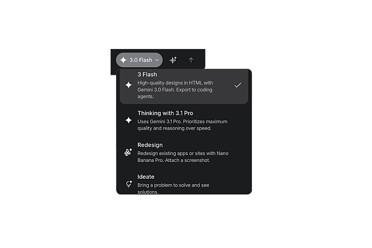
It has four generation modes: Gemini 3.0 Flash (optimised for speed), Gemini 3.1 Pro Thinking (optimised for quality and reasoning), Redesign (redesign existing apps from screenshots), and Ideate (explore creative directions through conversation before generating anything). Free while in Google Labs, with generation limits - 350 per month in Standard mode and 50 in Experimental mode.
Attempt 1: Detailed Prompt with Gemini 3.1 Pro
My first instinct was to be comprehensive. I wrote a ~5,000-character redesign brief with my full colour palette, every page URL on my site, detailed design direction, typography preferences, and page-by-page notes describing what each section should feel like. I used the most capable model available - Gemini 3.1 Pro Thinking.
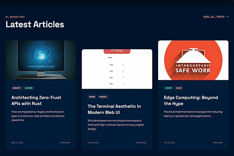
To be fair, the result wasn't bad. Stitch understood the structure I was going for - hero section with an image and description, three article cards below, a "view all posts" button, subscription form, and a navigation menu. It was a pretty good job given a single detailed prompt.
Along with every generated design, Stitch produces a visual design system overview - a grid showing the colour palette with swatches and hex values, typography samples for headlines, body text, and labels, button variants, icon styles, and UI components. It's essentially a visual representation of what gets exported as the DESIGN.md file - though you can't download the images or export this view to any format other than the DESIGN.md itself.
The layout followed my existing site's approach closely, which meant the output felt familiar rather than fresh. But the details had issues. The three article cards weren't the same height - a classic alignment problem. The hero image was AI-generated (a person standing in a sci-fi corridor) and had nothing to do with me. There was an unnecessary footer section with generic quick links. And Stitch hallucinated my location as "Berlin, Germany" - I've never lived in Berlin 🙂
Nothing catastrophic, but nothing that made me think "this is better than what I already have." It was roughly the same design back at me, with a few rough edges and hallucinated details added.
A decent starting point from a single prompt, but I wanted something that would actually reimagine the layout, not just reproduce it with imperfections.
Attempt 2: Short Prompt with Gemini 3.0 Flash
For the second attempt, I stripped everything back to ~600 characters. No URLs, no page structure, no tech stack. Just the feeling I wanted. And this time I used the faster model - Gemini 3.0 Flash - to see if a simpler approach would produce cleaner results:
A personal developer blog home page for a software engineer named Aleks. Dark mode first.

Vibe: playful, creative, developer-flavoured — like a terminal meets a modern magazine.
Not corporate, not sterile.

Hero section with a terminal-style greeting like "> hello, I'm Aleks_" with a blinking
cursor. Short bio underneath.

Below that, a "Latest Articles" section showing 3 blog post cards with colourful tag badges.

Footer with a subscribe-to-newsletter form.

Colour palette: coral red (#ee5f53) as primary accent, dark navy (#173353) as base,
light coral (#f1918b) for secondary highlights.
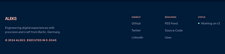
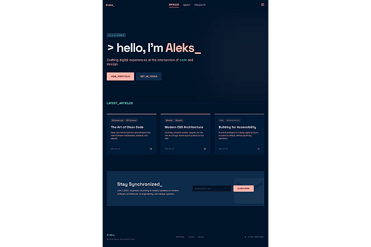
The difference was noticeable. All three article cards were the same height - no alignment bugs. The footer was minimal and intentional, with a single row of links. There was no AI-generated images this time - just clean cards with coloured gradient top borders that looked deliberate rather than placeholder. The subscribe section was tight and purposeful: "Stay Synchronized_" heading with an inline email input.
Compared to Attempt 1, the shorter prompt with the faster model produced a cleaner, more consistent design. No hallucinated locations, no generic sci-fi hero images, no misaligned cards.
Counter-intuitive finding: the faster, simpler model produced a better design than the thinking/reasoning model. Less overthinking meant fewer layout bugs. If you're using Stitch, don't assume the most powerful model gives the best results.
Attempt 3: Redesign My Actual Site
Stitch has a Redesign mode that takes a screenshot of an existing app and redesigns it. This felt like the most natural approach for my situation - show Stitch what I already have and let it reimagine it. I took a screenshot of my current home page and fed it in.
This was arguably the worst attempt of all. Stitch followed my existing layout too closely - same single-column structure, same content flow, same vertical rhythm - and just wrapped everything in clunky terminal-style window frames. My clean, readable site became cramped and busy. It wasn't a redesign - it was a reskin, and not a flattering one.
On top of that, the OCR quality was rough. Because Redesign mode reads content from the screenshot, article descriptions came back garbled - "JevaEcrtge!" instead of "JavaScript" and "Tipkevki" instead of "Trpkovski." So the design was a step backwards and it couldn't even reproduce my content accurately.
Attempt 4: Ideate Mode - Everything Changed
This is where the story turns. Stitch's Ideate mode works fundamentally differently from the other modes. It doesn't jump straight to generating visuals. Instead, it thinks first - proposing creative directions, building a specification, asking you to make choices before it touches a single pixel.
Ideate mode is only available when starting a new project. You can't switch to it when iterating on existing designs.
I started a fresh project and described my vision.
Instead of generating a design, Stitch came back with three distinct creative directions: Neon Terminal (dark, immersive, CRT glows and aggressive asymmetry), Soft Cyber (bright, airy, floating elements in whitespace), and Brutalist Arcade (raw thick borders, 8-bit aesthetic, editorial zine feel).
For the first time in this experiment, I was making a creative decision instead of just accepting whatever the AI generated. That shift - from passive recipient to active collaborator - made all the difference. I chose Neon Terminal.
The PRD - This Is the Game Changer
Before generating any visuals, Stitch produced a detailed Product Requirements Document - a proper written specification for the entire project. This is what makes Ideate mode fundamentally different. Other modes jump straight to pixels. A PRD captures the thinking behind the design - why it works, how interactions behave, what happens in edge cases - which is infinitely more useful when you hand it to a developer or coding agent later.
The PRD included a complete design system with CSS custom properties, four screen specifications (Home, Article Detail, Archive, and a bonus "Now" page) each with layouts, components, and responsive breakpoints, user flows with step-by-step interaction descriptions, and screen states for empty/loading/error conditions - all themed to the terminal aesthetic (NO LOGS FOUND, [ SYSTEM BOOTING... ], ERR_CONNECTION_REFUSED).
But my favourite part was the UX copy. > whoami as the hero heading. > ./subscribe.sh for the newsletter. EXEC_TIME: 4ms instead of "4 min read." > READ.EXE instead of "Read more." Tag badges as [#TypeScript]. These creative details would take hours to brainstorm manually - Stitch generated them as part of a coherent design language in seconds.
The PRD was more valuable than all the visual outputs from my first three attempts combined.
The Screens
After approving the PRD, Stitch generated the actual UI screens. Slower than Flash, but noticeably better quality. It also generates desktop, tablet, and mobile views automatically - you can preview responsive behaviour before writing a single line of CSS.
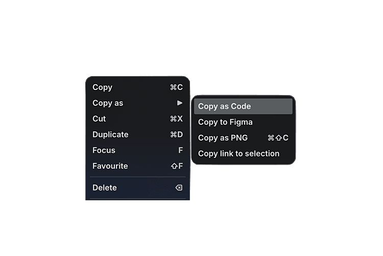
And there's a "Copy as code" feature: right-click any screen and get the complete HTML/CSS/JavaScript with Tailwind config and animations included.
Though it wasn't perfect. Overflow issues appeared across multiple tablet and mobile views - on the Home page, for instance, the navigation Subscribe button was cut off and overflowing on mobile. The Article Detail tablet view had similar problems with content spilling outside its container. And one screen got permanently stuck in "Generating Screen..." mode and never completed. The tool is still experimental, and the responsive behaviour needs work.
Refining and Building Out All Pages
The Ideate output was the best by far, but it was generic - "Neon Terminal" as the site name, placeholder navigation, wrong fonts. I refined it with my actual branding (site name, navigation structure, Ubuntu font, tag colours, social links) and then generated the remaining pages one at a time with Gemini 3.0 Flash.
Each page brought its own creative surprises:
- Keyboard Lab - grayscale-to-colour hover effects on keyboard photos, specs as terminal readouts (
> Switch: [Topre 45g Silent]),> INSPECT.EXEbuttons matching the> READ.EXEpattern - Through The Lens - portrait-ratio gallery cards with backdrop-blur category labels, photo count badges (
[ 12 PHOTOS ]), terminal headers likeCAT_01_ASTRO.EXE - About Me - career timeline styled as
GIT_LOG --CAREER --ONELINEwith actual commit hashes and fading opacity for older roles. My favourite creative touch from the entire experiment - Get In Touch - form labels as
IDENTIFY_USER,RETURN_PATH,TRANSMISSION_DATA. Social links as terminal commands:> ssh github.com/trpkovski,> ping linkedin.com/in/trpkovski
The Big Problem: Consistency
Each page looked good in isolation. Together, they were a mess of inconsistencies.
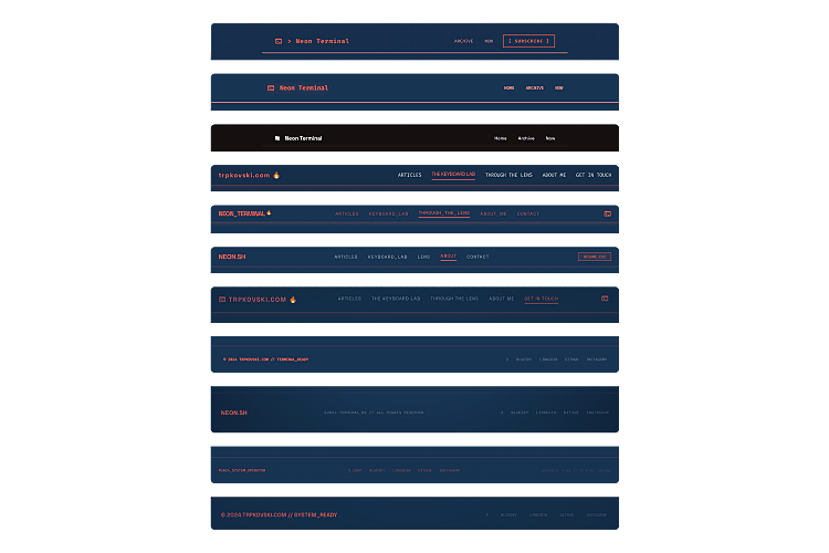
Stitch does not maintain a design system across screens. Every new page generated its own Tailwind config with different colour tokens, different font imports, and different structural patterns. I asked for Ubuntu as the body font repeatedly and kept getting Plus Jakarta Sans or Space Grotesk. The site name appeared as "NEON_TERMINAL" on one page, "NEON.SH" on another, and "trpkovski.com" on a third. Footer layouts were different on every single screen. The CRT scanline effect - a core part of the aesthetic - was implemented multiple entirely different ways across eight pages.
This is the most important finding from the entire experiment: Stitch gives you creative direction, not a consistent codebase. You will need to unify everything yourself.
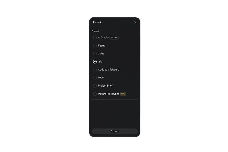
The Export
Select all screens, click Export → ZIP, and you get a clean package: each screen as code.html + screen.png, plus a shared DESIGN.md capturing the design system. You can also export to Figma (Standard Mode) or Google AI Studio.
stitch_neon_terminal_prd/
├── neon_terminal/
│   └── DESIGN.md
├── home/
│   ├── code.html
│   └── screen.png
├── article_detail/
│   ├── code.html
│   └── screen.png
├── the_keyboard_lab/
│   ├── code.html
│   └── screen.png
├── through_the_lens/
│   ├── code.html
│   └── screen.png
├── about_me/
│   ├── code.html
│   └── screen.png
└── get_in_touch/
    ├── code.html
    └── screen.png
The DESIGN.md captures the creative philosophy, colour palette with surface hierarchy, typography pairings, component patterns, and explicit do's and don'ts. Useful as a starting point, though it inherits the same inconsistencies from the screens.
What's Good
- Ideate mode is genuinely powerful. It feels like working with a design consultant, not a random image generator. The multi-step workflow - concepts, then spec, then visuals - produces far better results than jumping straight to pixels
- The PRD is often more valuable than the visuals. Design tokens, component specs, interaction states, UX copy - this is real design system thinking
- "Copy as code" bridges design and development. Clean HTML/CSS/Tailwind for any screen, ready to feed into a coding workflow
- Completely free while in Google Labs
- Creative ideas you wouldn't come up with - details that would take hours to brainstorm manually
- Multiple export paths. Figma, Google AI Studio, ZIP with code and assets,
DESIGN.md
What's Not So Good
- No design system consistency across screens. Every page generates its own config, colours, and fonts - the biggest limitation
- Ignores specific requests. I asked for Ubuntu font repeatedly and kept getting other fonts
- Layout bugs persist. Misaligned cards, overflow issues, tablet views that cut off content
- Redesign mode is essentially a reskin. Too faithful to the original structure to be useful for genuine redesigns
- OCR errors and hallucinated content. Garbled text from screenshots, invented locations, fabricated career histories
- Ideate mode locked to new projects. The most powerful mode isn't available when iterating on existing work
So Was It Successful?
About halfway there.
Stitch didn't give me anything close to a production-ready redesign. The designs have inconsistent colour systems, wrong fonts, varying layouts, and bugs that would need serious work before anyone could ship them. If I'm judging purely on "can I take this output and deploy it" - the answer is no.
But that's not really the right question. What Stitch did give me was a design language I wouldn't have arrived at on my own. The terminal aesthetic, the interaction patterns, the UX copy, the component system (Hardware Header + Media Bay + Console Output) - these are genuinely good design decisions that came from a few conversations with an AI. The PRD from Ideate mode alone was worth the entire experiment.
The real question is whether the other half can be closed by pairing Stitch's output with a coding agent. Can Claude Code take the DESIGN.md, the exported screens, and a spec-driven workflow, and turn this 50% into something I'd actually want to deploy?
That's exactly what we'll find out in Part 2. The design is done. Let's see if the code can keep up.
Further Reading
Explore more articles that might interest you.