From Google Stitch Design to Live Site with Claude Code and Spec-Kit
3rd May 2026 • 10 min read — by Aleksandar Trpkovski
Play audio summary

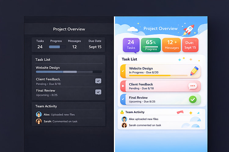
In Part 1, I spent a couple of weeks experimenting with Google Stitch - testing different modes, refining prompts, and generating a full set of screens for a retro-futuristic "Neon Terminal" redesign of this blog. The designs were genuinely impressive. But the conclusion was honest: Stitch gets you about halfway there. The screens looked great individually, but the design system wasn't consistent across pages, and the exported code wasn't production-ready.
The question I left you with was: can a coding agent close the gap?
This is that article. I took Stitch's design system, fed it into GitHub's spec-kit, and used Claude Code to build a real, deployed Nuxt 4 static site. Here's the full process - what worked, what didn't, and what surprised me.

The Bigger Picture: AI Is Changing Design
This experiment didn't happen in isolation. The design space is shifting fast, and Google Stitch is far from the only player.
Figma Make launched at Config in May 2025, letting you go from designs to functional prototypes using natural language prompts. Lovable has been growing rapidly as an AI-first app builder - describe what you want, get a working prototype in real time. ui.sh, from Adam Wathan and Steve Schoger (the creators of Tailwind CSS and Refactoring UI), takes a different angle - it's a toolkit that gives coding agents design rules and patterns so they make better decisions about spacing, hierarchy, and typography. And just a couple of weeks ago, Anthropic announced Claude Design - a tool that reads your codebase, builds a design system, and packages everything into a handoff bundle for Claude Code.
The entry barrier for design has been set extremely high by these tools. I know the results aren't perfect - a professional designer would probably pick up some weird decisions. But as a starting point, it's more than enough. I genuinely believe that Google Stitch setting up the design system and rules, combined with Claude Code filling in the gaps, produces results that would have taken me weeks to achieve on my own.
This is just the beginning. Let's get into how it actually worked.
Spec-Driven Development with Spec-Kit
Instead of jumping straight into Claude Code and starting to hack, I wanted to try something structured. GitHub's spec-kit is an open-source toolkit for spec-driven development - you start with a specification that becomes the source of truth your AI agent works against.
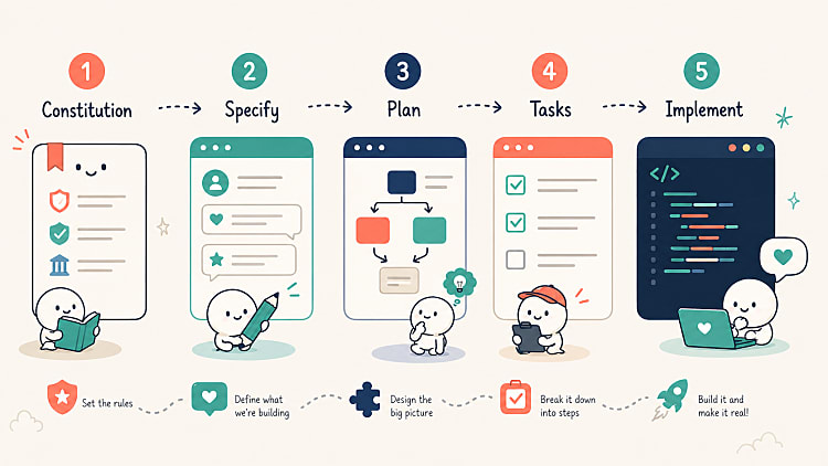
The workflow has a clear sequence:
- Constitution - Define core principles and quality gates
- Specify - Write the full specification with user stories and requirements
- Plan - Generate the implementation plan, research decisions, and data model
- Tasks - Break everything into phased, ordered tasks
- Implement - Let the agent execute all tasks
The idea is that you front-load the thinking. The agent can only implement what it's told - so the better your spec, the better the output.
Setting Up
Before running any spec-kit commands, I set up the foundations:
- Created a fresh Nuxt 4 project (minimal template)
- Installed Tailwind CSS with
@tailwindcss/viteand Prettier withprettier-plugin-tailwindcss - Installed the spec-kit CLI and initialised it
- Created
CLAUDE.mdwith project instructions andspec-kit-context.md- a corrected, authoritative design system that fixes the inconsistencies from Stitch's exportedDESIGN.md - Copied the Stitch exports (HTML + PNG per page) into the project
That spec-kit-context.md is key. Remember from Part 1 - Stitch doesn't maintain a design system across screens. Different pages had different fonts, different colour tokens, different footer styles. So I created a single source of truth: the corrected colour palette, typography rules, component patterns, and UX copy mappings. Everything the agent would need to build consistently.
neon-terminal/
├── CLAUDE.md                        # Project instructions for Claude Code
├── spec-kit-context.md              # Corrected design system (authoritative)
├── stitch_neon_terminal_prd/        # Stitch exports (HTML + PNG per page)
├── nuxt.config.ts
├── app/
│   ├── assets/css/main.css          # Tailwind @theme tokens
│   ├── components/
│   ├── data/
│   └── pages/
├── content/                         # Markdown articles (Nuxt Content)
└── .specify/                        # spec-kit templates and memory
Running the Spec-Kit Pipeline
Constitution (~1m 17s)
I defined five core principles: Design System Fidelity, Static Site Generation, Code Quality, Accessibility (WCAG AA contrast), and Performance (CSS-only animations, lazy-loaded images). These become the quality gates all implementation must comply with.
One small detail: spec-kit ships with a set of built-in skills - slash commands like
/speckit-constitution,/speckit-specify, and so on. Each skill handles one stage of the pipeline. The constitution skill tried to auto-chain into the next stage but got blocked bydisable-model-invocation. Spec-kit skills must be manually invoked one at a time - it expects a human in the loop at each stage.
Specification (~1m 40s)
The Stitch design system got translated into testable requirements: 7 user stories, 16 functional requirements, 8 success criteria, 6 key entities. No [NEEDS CLARIFICATION] markers - the spec was complete.
I also pivoted from "all content hardcoded" to using Nuxt Content for markdown articles at this stage. My existing blog already has all articles as markdown files, so migrating them made more sense. Spec-kit adapted smoothly.
Plan (~3m 15s)
Four artefacts generated: implementation plan, research decisions, data model, and developer setup guide. Some good technical decisions emerged - @nuxt/fonts for Google Fonts, Tailwind CSS v4 @theme directive for design tokens, nitro.preset: 'vercel-static' for Vercel SSG, and 12 reusable components identified.
One gotcha: the setup script failed with
ERROR: Not on a feature branch. Spec-kit expects a feature branch by default. Workaround: setSPECIFY_FEATUREas an environment variable.
Tasks (~1m 55s)
49 tasks across 10 phases. Clear dependency chain - the Foundational phase blocks everything, then user stories run independently.
Implementation (~12m 8s)
This is where you sit back and watch. Claude Code worked through all 49 tasks and the build completed with 41 routes pre-rendered as static HTML.
One nice surprise: Claude Code generated actual SVG placeholder images for articles, keyboards, photos, and the avatar. It gave the design something to render instead of broken image icons. Small but thoughtful.
First Look: What Worked and What Didn't
I opened the site in the browser. First impression: the design system consistency was actually better than what Stitch produced. The cross-page inconsistencies were gone. The whole site felt like one cohesive design language.

But it wasn't perfect:
- Tags were static labels, not clickable links to filtered listing pages
- No related articles section below article detail pages
- No active navigation state when on a page
- Bad contrast on several tag badges despite the constitution requiring WCAG AA
- Code snippets had zero syntax highlighting
- Duplicate hero images when migrating real articles
- No favicon, flat URL slugs instead of date-based ones

The spec-kit pipeline got me about 70% of the way there. The remaining 30% was where things got interesting.
The Manual Fix Phase
I started working directly with Claude Code to fix issues one by one. Here are the highlights.
Spec Gaps: Things I Should Have Specified
URL slugs - my existing blog uses /articles/YYYY/MM/DD/slug. The spec said "reference the existing blog" but didn't spell out the URL pattern. Claude Code defaulted to flat slugs. Fixed immediately once asked, but it should have been in the spec.
Tag pages - the original blog has dedicated pages at /{tag} with per-tag SEO metadata. I pointed Claude Code at my existing blog repo and it investigated the routing pattern autonomously, then replicated it - including slug mappings, SEO metadata, and prerender routes for all 26 tags. About 6 minutes 30 seconds of work.

Active navigation - basic UX that the constitution didn't cover. Nav links had no active state at all - no highlighting when you were on the current page or any of its child routes. Fixed once flagged.
Tag contrast - the constitution said WCAG AA, but the implementation used a hardcoded text colour on every tag badge. Claude Code fixed it with a luminance check that picks light or dark text based on background colour.

Creative Surprises
The cursors - I asked Claude Code to design a custom SVG cursor. It proposed three options and I went with a >_ terminal prompt symbol for clickable elements. But it didn't stop there - the full set ended up being three cursors, all sharing the same neon design and primary colour. The default arrow cursor was restyled to match the same neon terminal style. Text-selectable areas got the | cursor, keeping the natural browser behaviour but in the same visual language. As for animation: >_ blinks, | blinks, but the arrow stays still. That kind of thoughtful design rationale from a coding agent was unexpected.

The same >_ symbol became the favicon too. Claude Code recommended it for brand consistency. So now it appears as the favicon, the hover cursor, and echoes throughout the UI.

Syntax highlighting - my old blog used Prism.js as static files. Claude Code discovered that Nuxt Content v3 ships with Shiki built in - no extra setup needed. It browsed 65+ themes, picked synthwave-84 as the best match for a neon/retro aesthetic, and overrode the background to match the Neon Terminal palette. I didn't know Shiki was built in before this redesign. Sometimes rebuilding a project teaches you better approaches.

Terminal animations - I asked Claude Code to be creative with animations. First pass was too aggressive - typing animations that hid content on load. Dialled it back to ambient effects: glow pulse on headings, subtle CRT flicker, footer "ONLINE" pulsing green. Iterating on creative requests is part of the process.
Content Migration
The biggest chunk of work was migrating real content from my existing blog. Stitch obviously couldn't generate any of this - it produces visual layouts, not the actual content that fills them. So I migrated everything in stages:
- Blog article markdown files - all existing articles migrated into
content/articles/YYYY/MM/DD/slug.mdwith frontmatter preserved. Cross-article links rewritten to the new URL structure - Through The Lens - my photography section. Migrated 6 categories with all their images and metadata. The agent built the masonry grids, detail pages, and PREV/NEXT navigation around the migrated content. Routes jumped from 185 to 414
- The Keyboard Lab - 3 mechanical keyboard builds with full specs and detail pages. Same migration pattern as photography
- About Me content - the bio, career timeline, tech stack, and descriptions. Replaced all placeholder copy with real content. The interactive avatar (315 WebP images that respond to mouse movement) was carried over from the old blog and adapted to the new theme

Components Designed From Scratch
A few components in the final site were never designed by Stitch - Claude Code built them from scratch matching the Neon Terminal aesthetic without any visual reference:
- Audio player - each article has an audio summary with transcript. The agent built a full player with terminal header ("AUDIO_SUMMARY.SH"), seekable progress bar, and a scrollable transcript with highlighted active segments
- Similar articles - cosine similarity on article embeddings to recommend 3 related posts at the bottom of each article. Server API route plus a terminal-styled component
- Custom cursors - the three SVG cursors with neon glow effects, and the matching
>_favicon
The fact that these blend seamlessly with the Stitch-designed components says something interesting about how well a coding agent can extend a design system, not just replicate existing designs.
Deployment
Deployment was the easiest part. The spec-kit implementation already configured nitro.preset: 'vercel-static'. Push to GitHub, connect to Vercel, deploy. Zero friction.
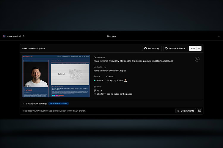
The live site: neon-terminal-two.vercel.app
The source code: github.com/Suv4o/neon_terminal
What I'd Put in the Spec Next Time
The manual fix phase taught me what should have been in the specification from the start:
- Existing URL patterns - spell out
/articles/YYYY/MM/DD/slugexplicitly - Tag pages with filtering and SEO metadata - functional requirements, not just visual badges
- Active navigation states - basic UX the constitution missed
- Contrast enforcement - a specific rule, not just "WCAG AA"
- Animation constraints - "animations must not delay content visibility"
- Content migration edge cases - test with real data, not just placeholders
Each gap added time to the manual fix phase. A tighter spec means a shorter refinement cycle.
The Numbers
| Phase | Time | Output |
|---|---|---|
| Spec-kit pipeline | ~20 min | 49 tasks, 41 routes, full site |
| Manual fixes | ~2 hours | 20+ fixes, content migration |
| Total | ~2.5 hours | 414 routes, deployed to Vercel |
What I Think About All This
I'm not going to pretend this replaces a professional designer. A designer would have caught the contrast issues before they shipped. They would have thought about active navigation states without being asked. They would have designed the audio player as part of the original design system, not as an afterthought.
But here's the thing: I don't have a designer. I'm a developer who wanted to redesign his blog. Before these tools existed, my options were either hire someone, learn Figma properly, or accept whatever I could cobble together in code. Now I have a third option: let Google Stitch set up the design system and the rules, and let Claude Code fill in the gaps.
The results aren't flawless. But they're genuinely good. The site is responsive, consistent, accessible (after fixes), and has a distinctive visual identity that I didn't have to design pixel by pixel. The design space is changing fast - Figma Make, Lovable, ui.sh, Claude Design - all approaching the same problem from different angles. The barrier to entry for good-looking software is dropping in real time.
It's not perfect yet, and designers still bring irreplaceable judgement to the process. But as a starting point, what these tools produce is more than enough to build something real.
This is just the beginning.
Further Reading
Explore more articles that might interest you.